At The King Eddy, we are always trying to improve on our past work. Each time we re-visited the menu I tried to make small changes within the format to refresh it but this time I felt like it was due for an overhaul.
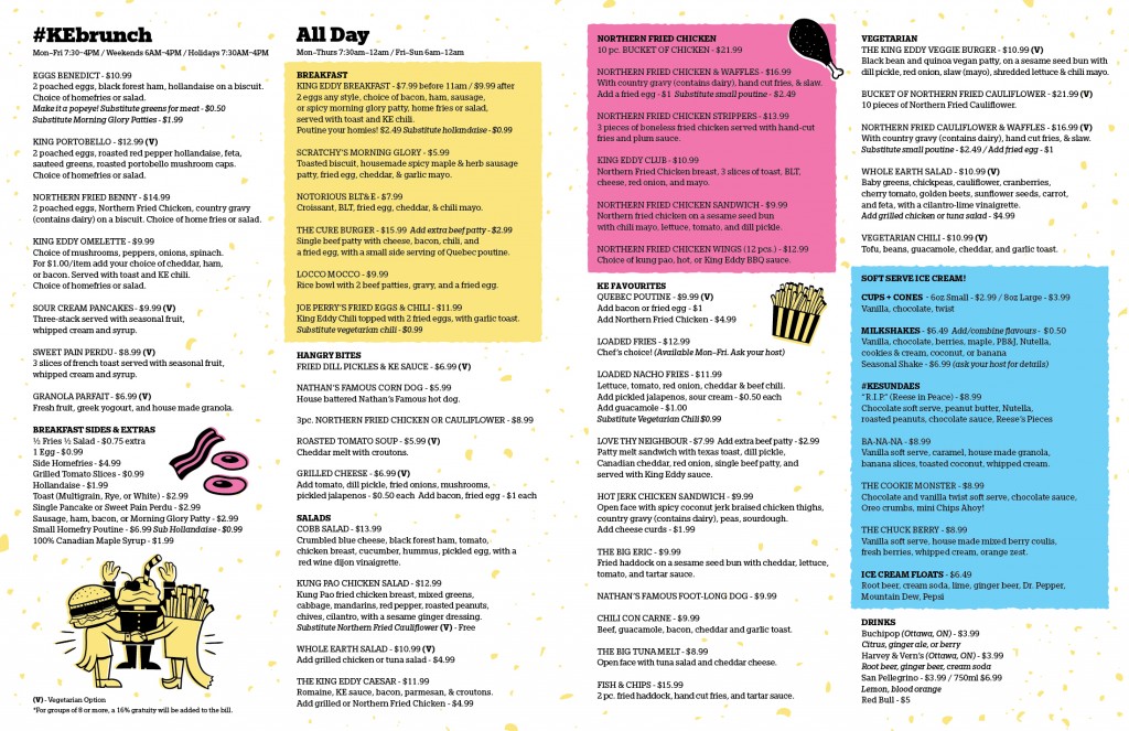
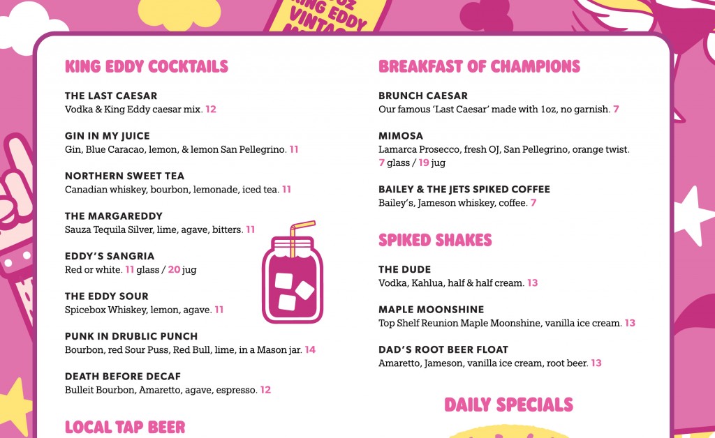
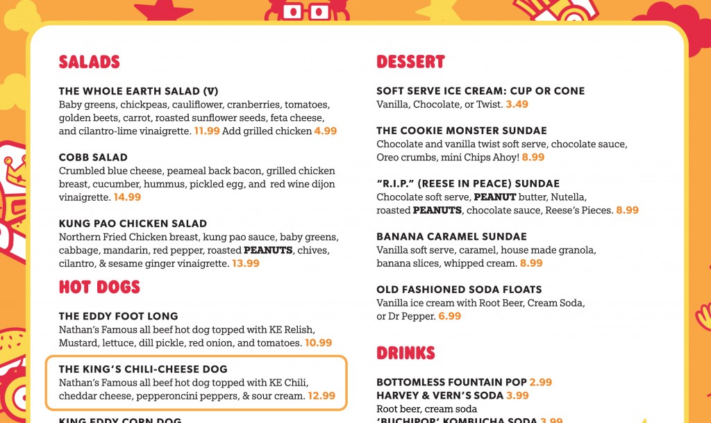
The main issue was the amount of information within the space. For simplicity’s sake we originally had the drink and food menu in one place but as the menu grew, it became difficult to accommodate more changes and additions. It had taken on a ‘wall of text’ look that I really wanted to get away from.
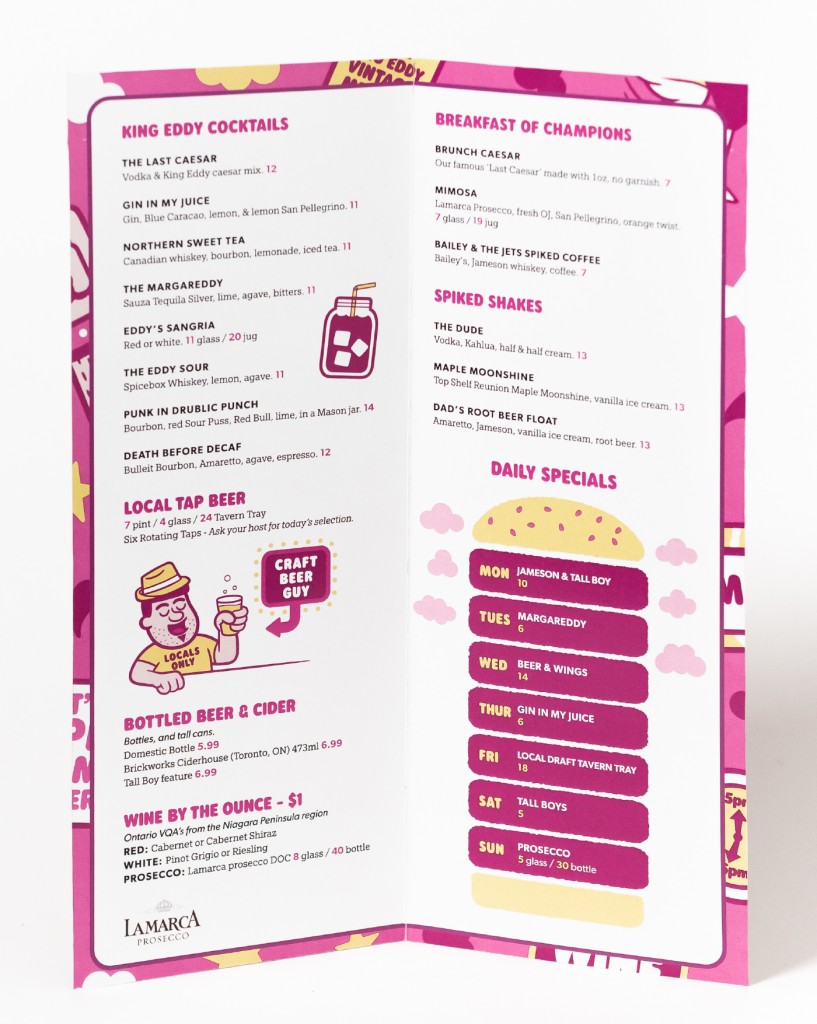
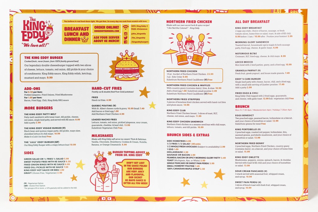
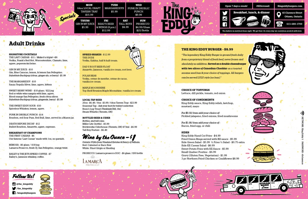
My plan was to break up the menu into two pieces. This would do a couple things: create more breathing room for the text making it more inviting to read, and open up opportunities for fun illustrations which are a big part of their aesthetic.
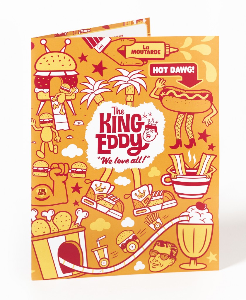
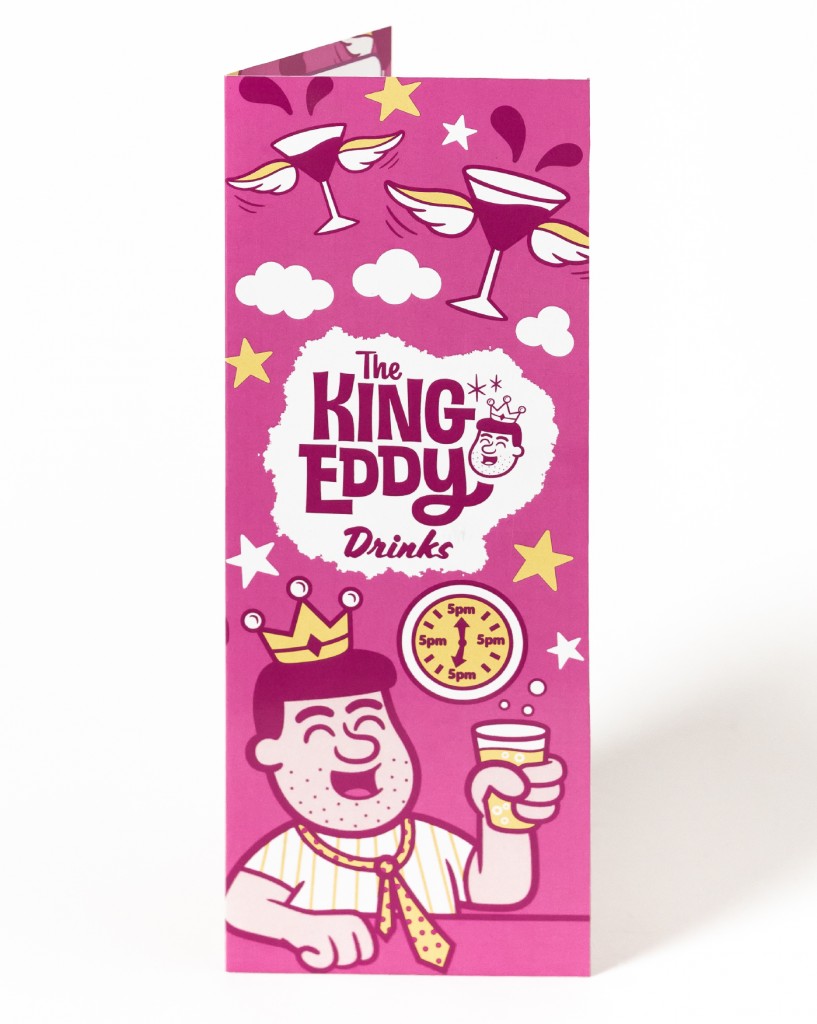
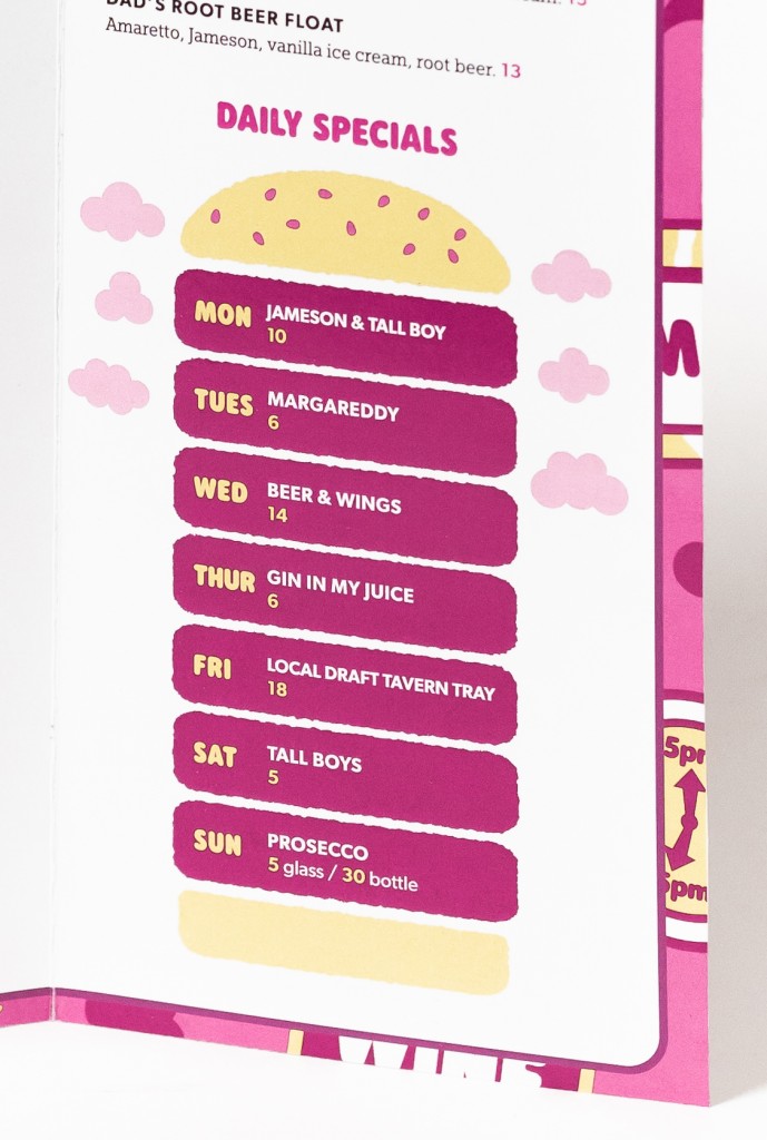
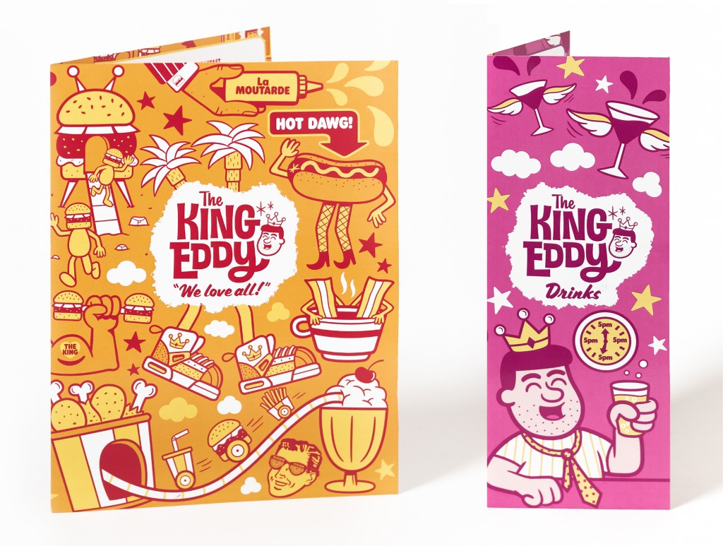
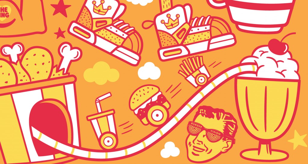
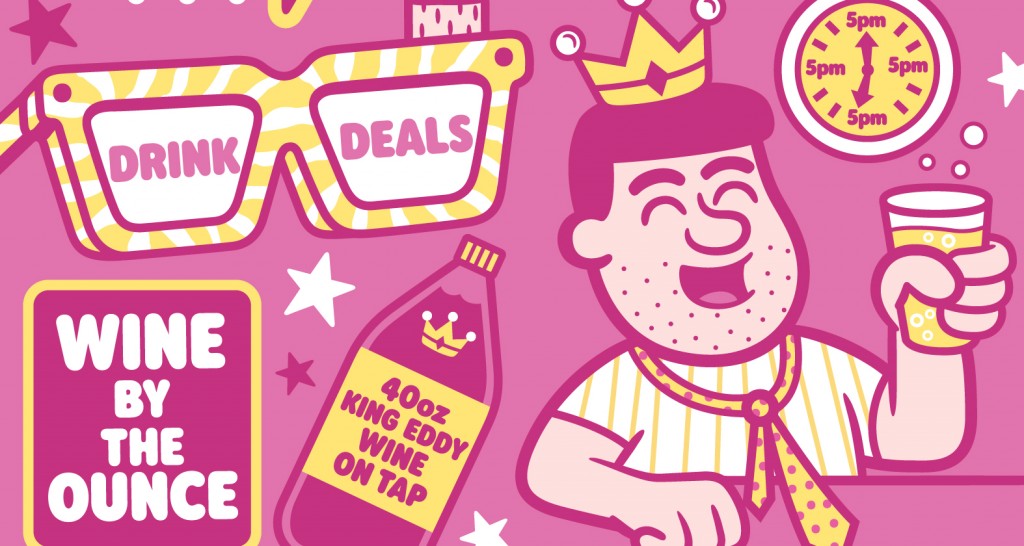
Once the approach was agreed upon, I got started with these full cover illustrations that would bring in more colour and give you a quick first impression of the vibe at King Eddy. Each would have a distinct colour scheme that would run throughout the menu.
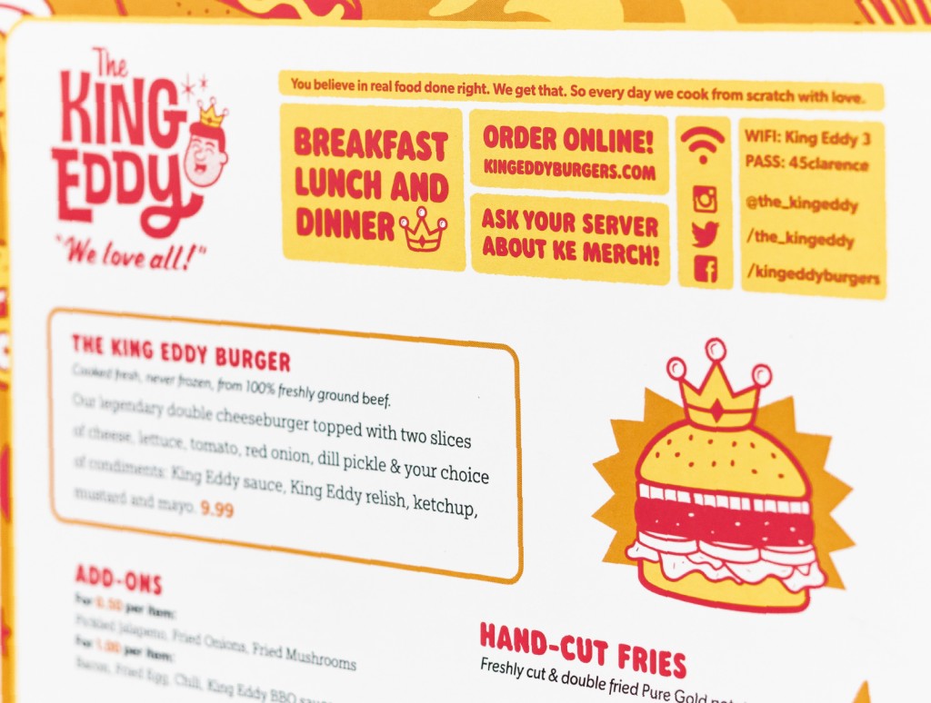
I gave the design a refresher by introducing two new typefaces. I brought in a bubbly sans serif for section titles and a more straightforward sans for item titles which helped distinguished sections and items better. This combined with the more generous line spacing was resulting in a look that was much more inviting to read.
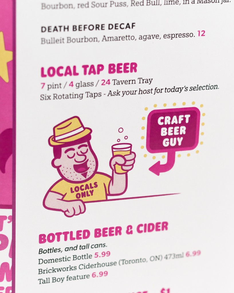
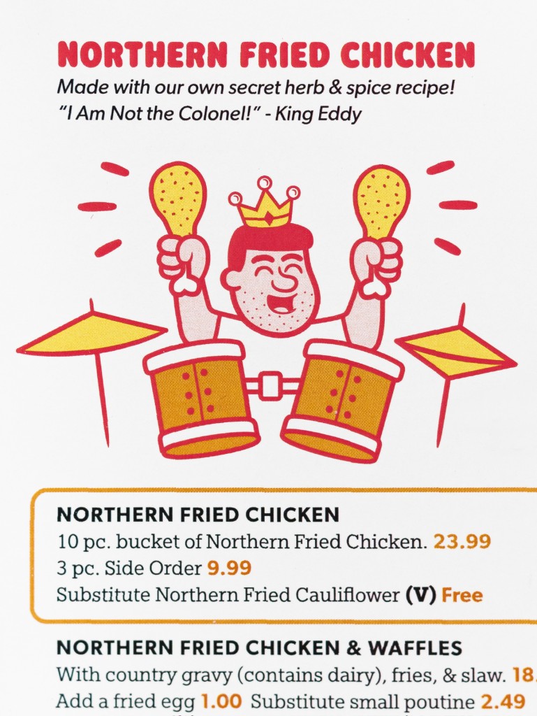
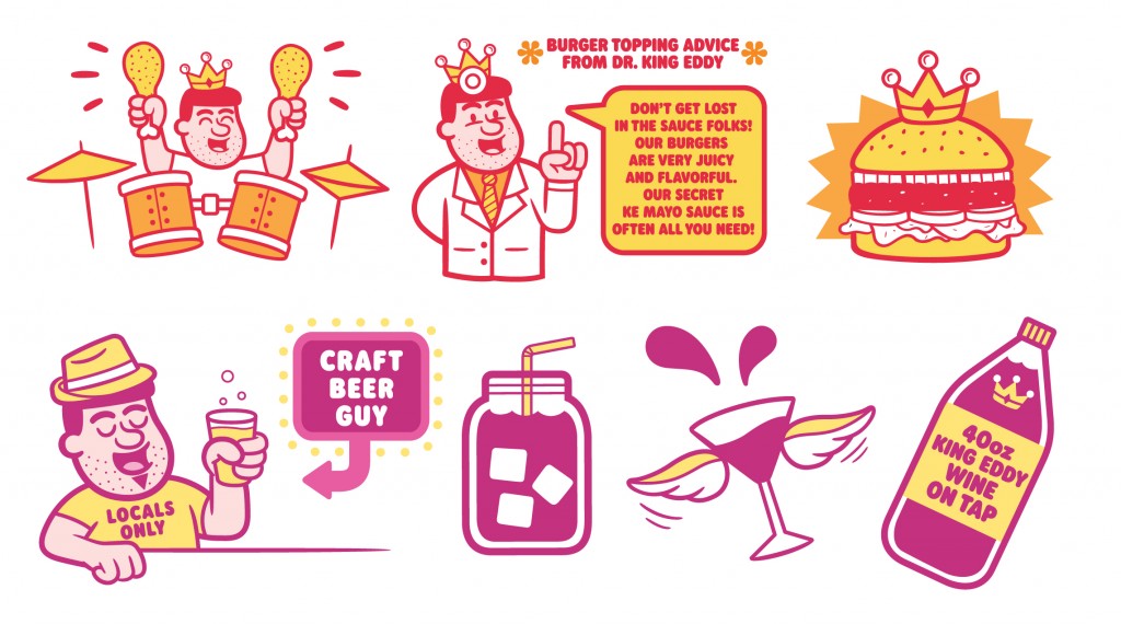
The final detail I wanted to bring in were some spot illustrations to help break up the text and bring attention to key menu items.
Here are some photos of the final product provided by the talented Jordan Wiens.
