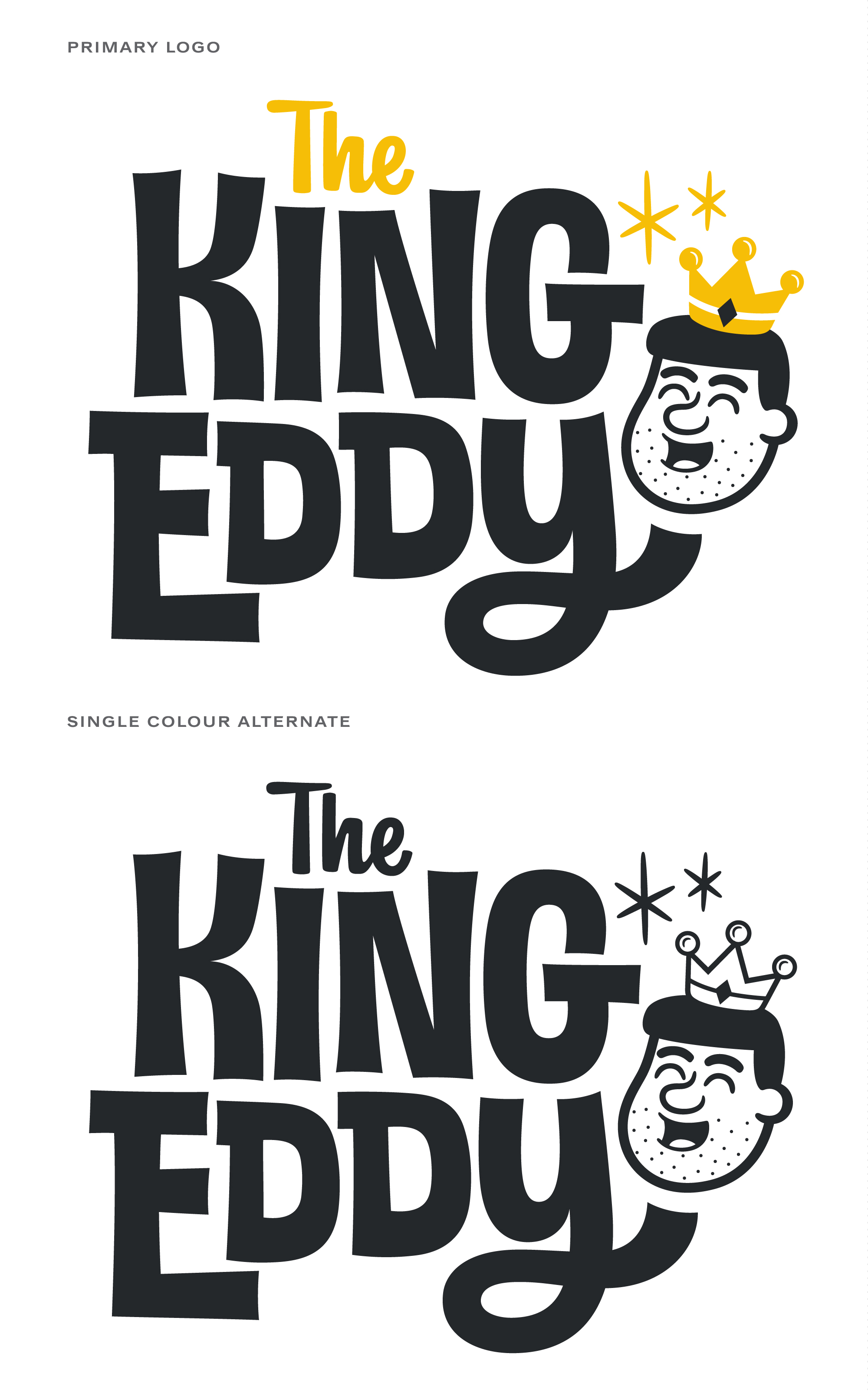
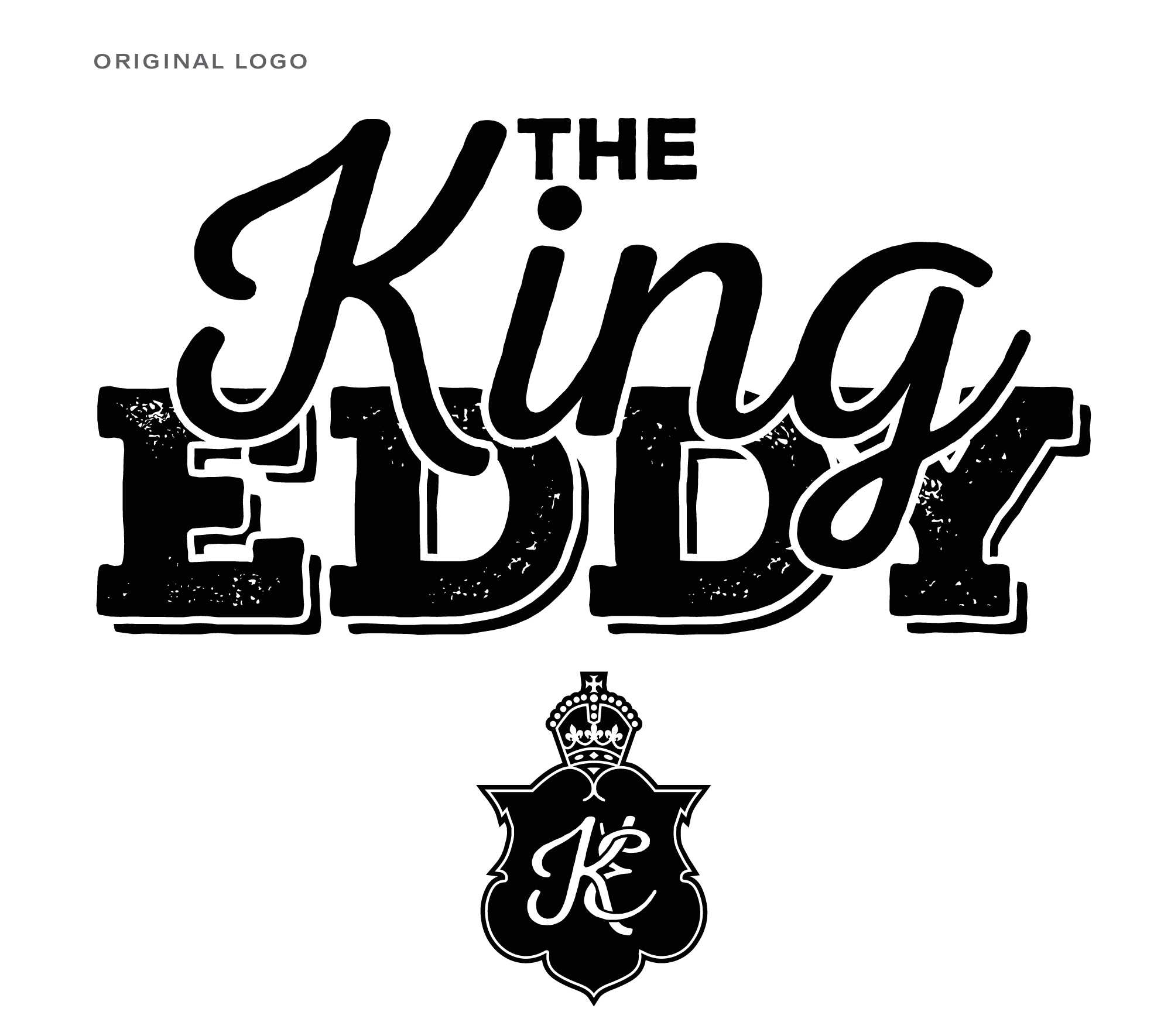
I was recently asked to redesign the logo for The King Eddy restaurant in Ottawa. They were requesting something that featured new lettering created specially for them so I was happy to take a look.
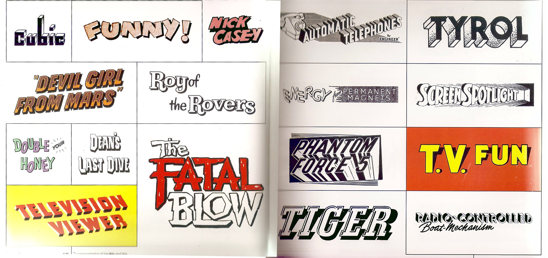
To get my mind warmed up for wordmark designs, I will often look at a variety of lettering styles and take note of what elements could be appropriate for the task at hand. I usually have a fuzzy idea of what the lettering should look like, and going through lots of other work can help bring that idea into focus by reminding me of possibilities to explore and things to avoid. This time around however, nothing I was looking at felt right for the project.
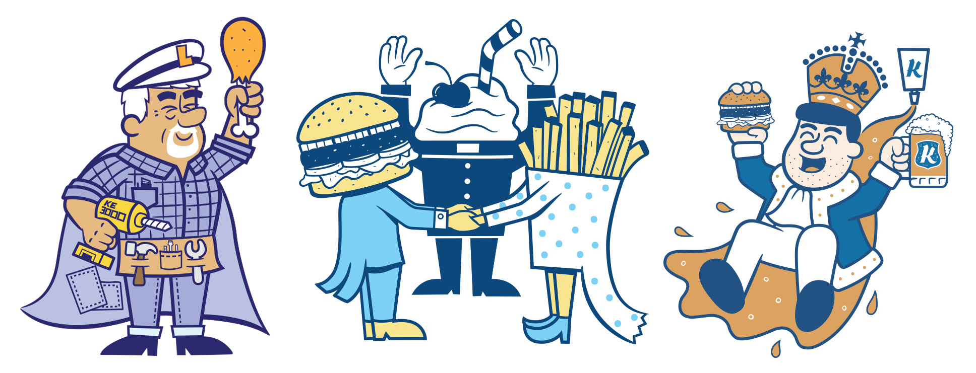
The King Eddy has always given me free rein to be as wacky as I like with the graphics and characters, and as a result the artwork is a pretty unfiltered version of everything I like in cartoons. Because of this, I realized it was important to do what comes naturally to me and not try to achieve another voice in the look of the logo.
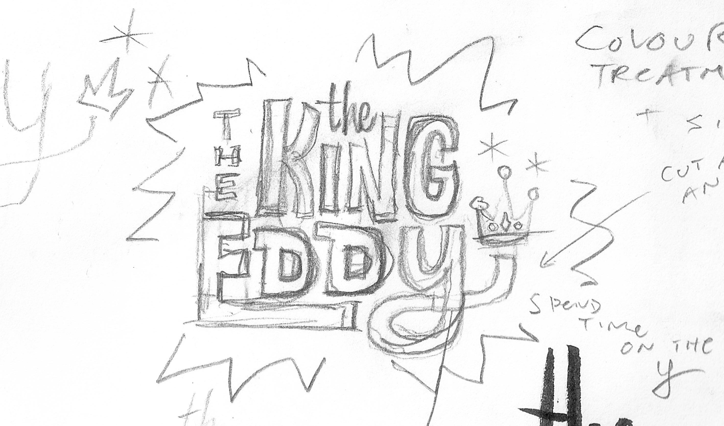
I put pencil to paper, and the first thing that came out was this very rough sketch that would become the foundation for the real thing. I surprised myself at how quickly that happened but I figured it was better not to question a good thing. At any rate, there was still a lot of work to be done to get it to a polished, presentable state.
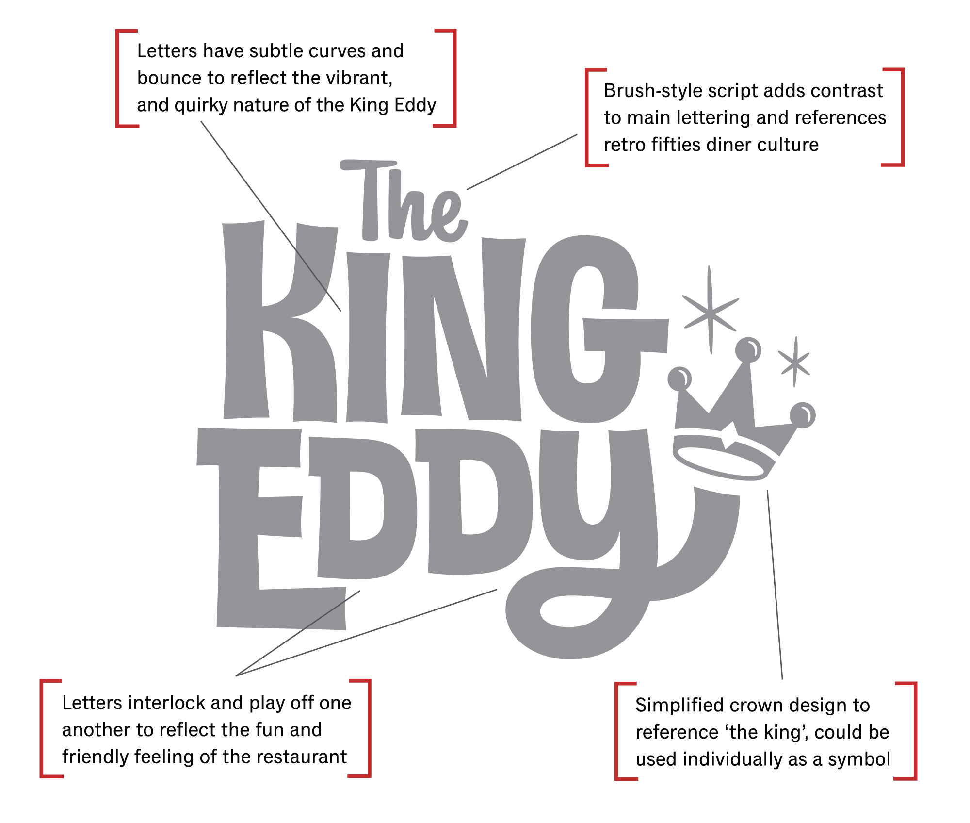
My aim was to make something that felt more warm and friendly than the previous logo. I felt that the lettering needed to better reflect the unique personality of the restaurant, as well as the aesthetic we’ve developed. I included this visual rationale to give a breakdown of why I was doing what I was doing.
The folks at King Eddy were very happy about the new direction but thought that the new crown might be too much of a departure from their old look. I felt that simplifying the old crown was important as it’s a little too ornate for the current style of the graphics and may not work as well at smaller sizes.
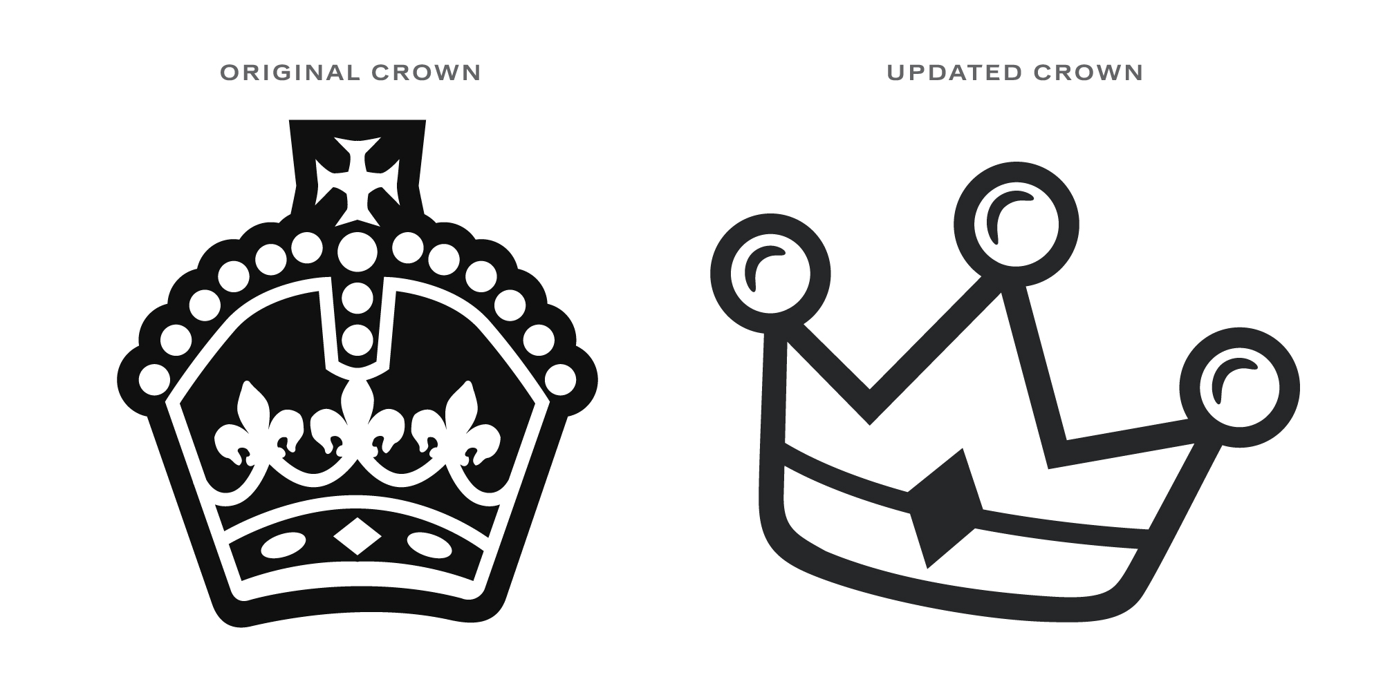
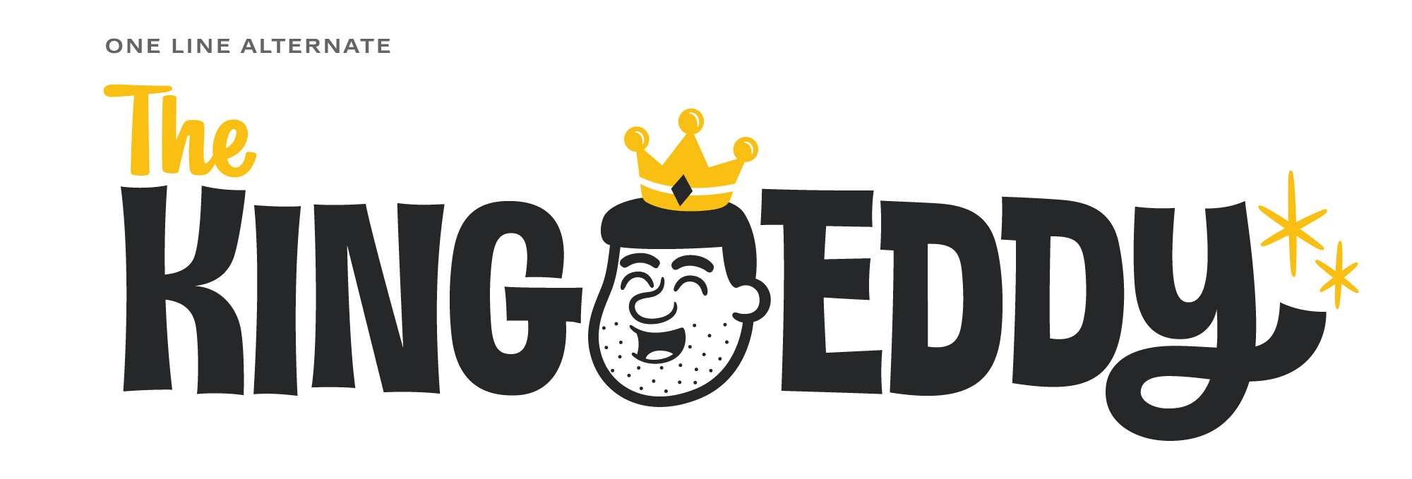
I proposed the idea to introduce the crown on the head of the familiar king character rather than isolated and that proved to be a good compromise. I provided one-line and single colour alternate versions of the logo and we were all wrapped up!