Case Study 5: Montreal Signs Project

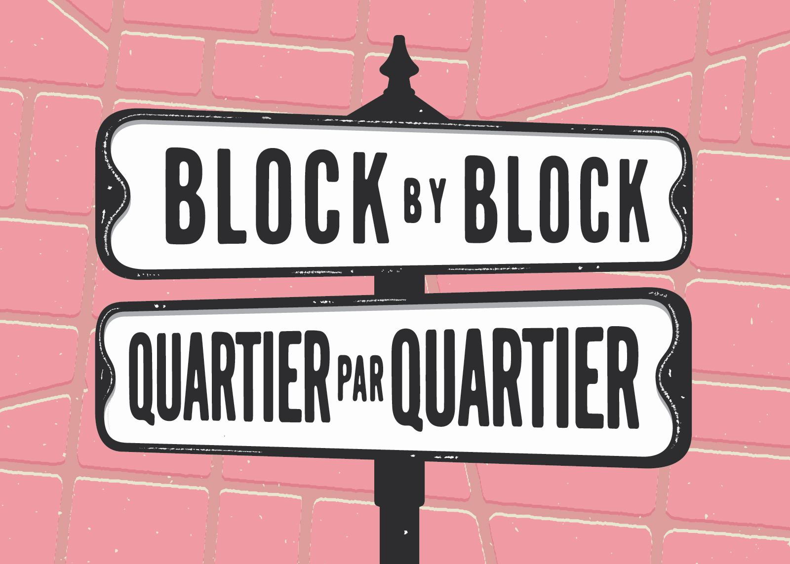
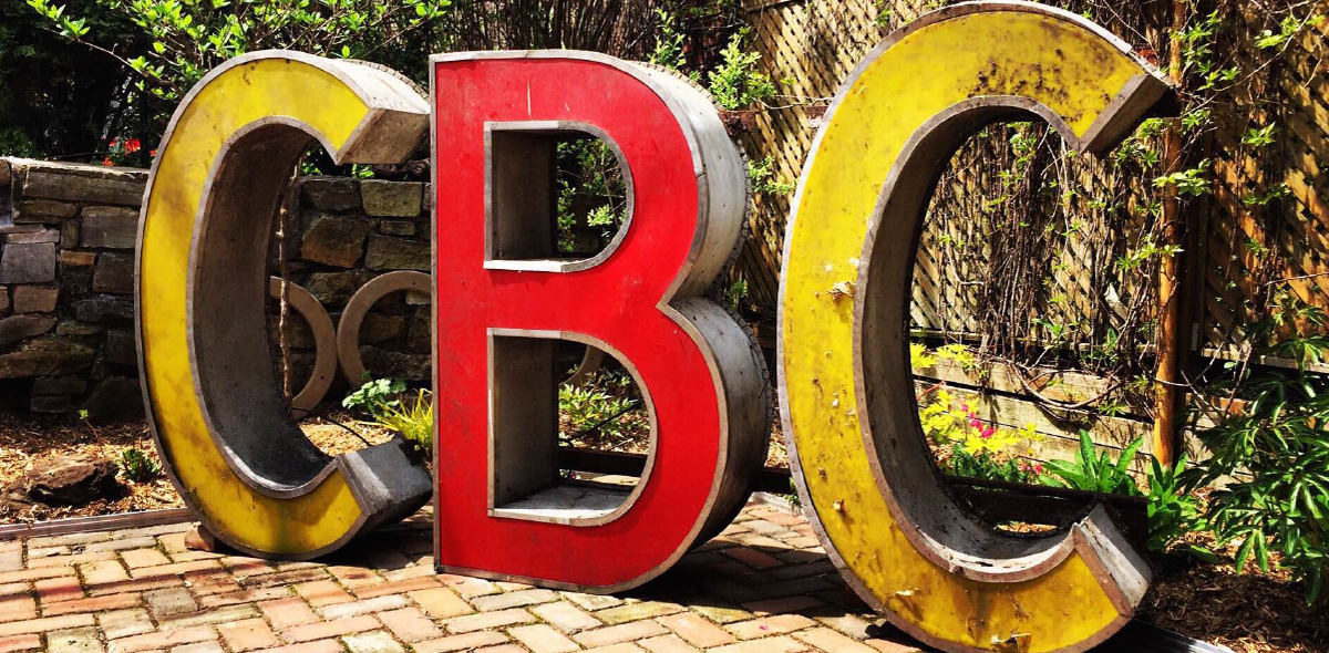
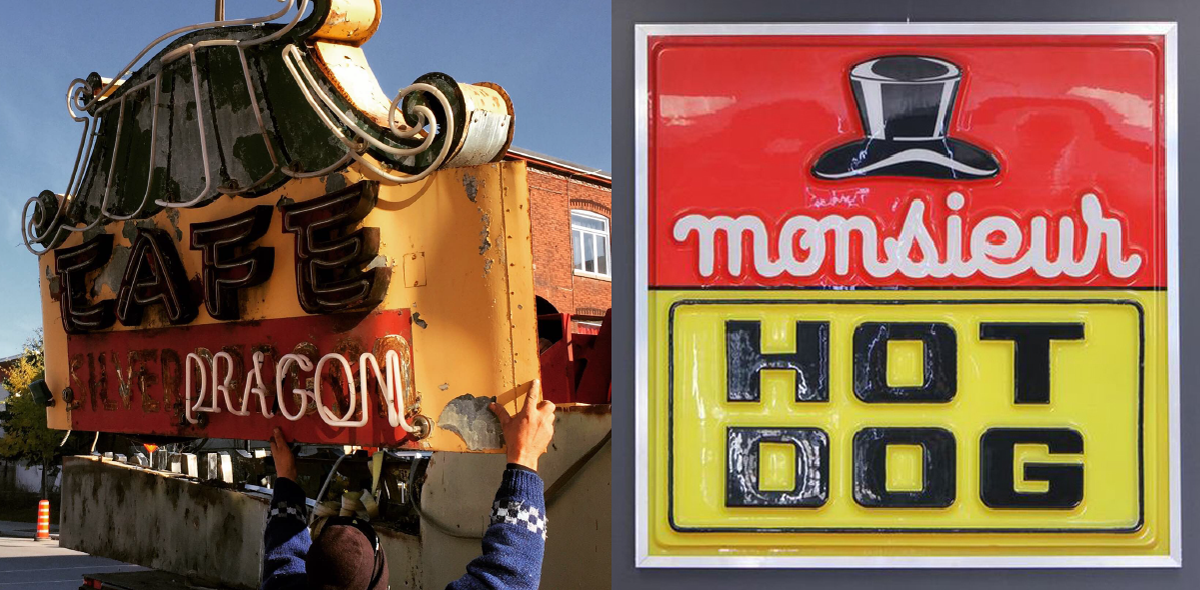
The Montréal Signs Project is an amazing organization that salvages vintage signage in Montreal and gives it a new home in the hallways of Concordia University. For obvious reasons this is an initiative that I have a ton of respect for and was very happy to get involved with.

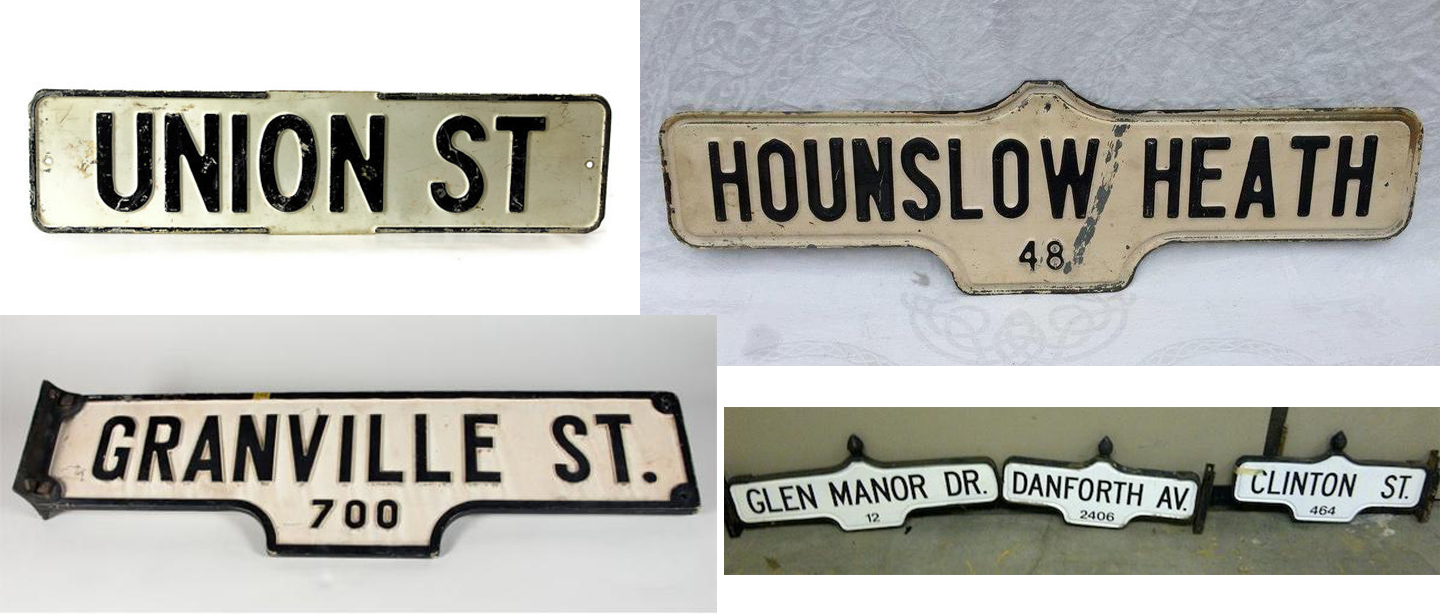
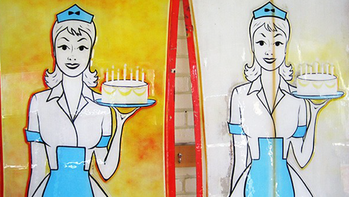
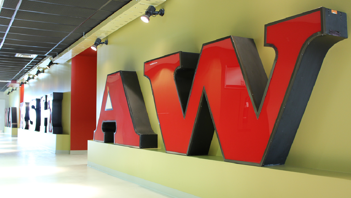
Our project began with a tour of the MSP’s collection at Concordia. The first thing that strikes you about the signs is the physicality: the scale, the materials, the rust and textures. I knew this was something I would like to incorporate into the artwork somehow.

Guerin-Photo
CBCPhoto
HotDog
Lady
Warshaw
Sheinarts

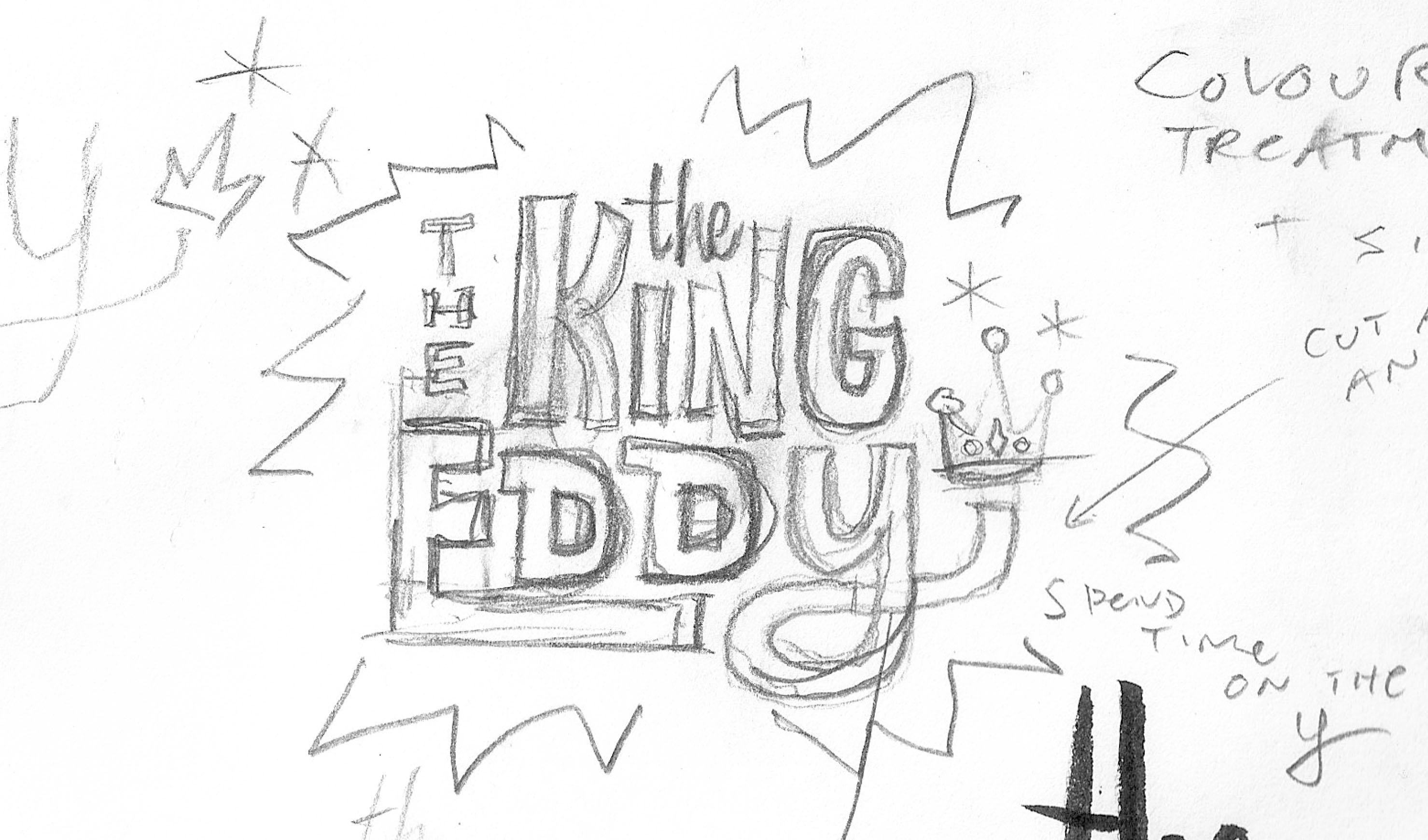
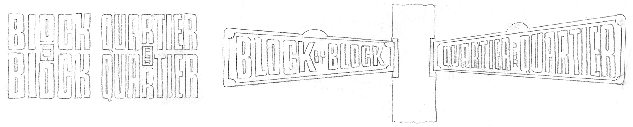
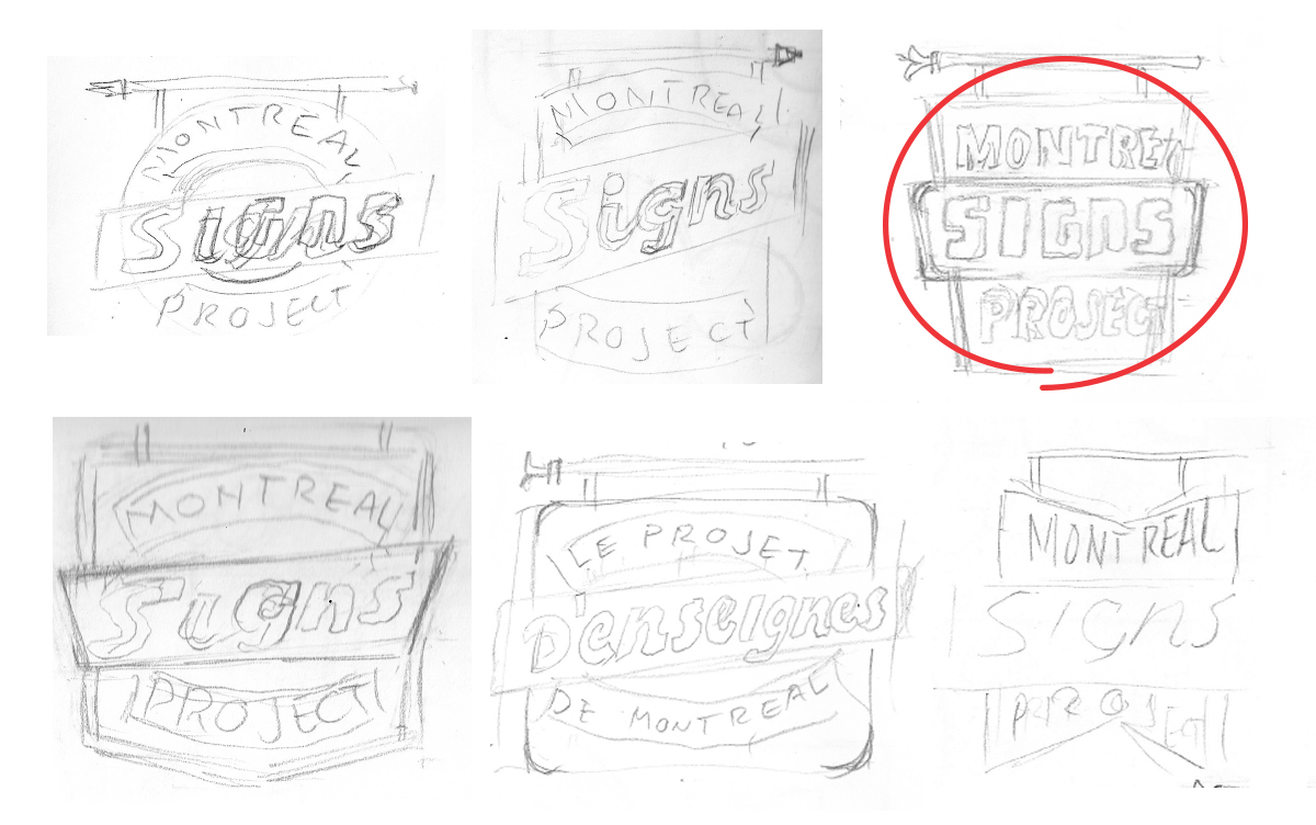
Once I decided that this should look like a real sign, I did some quick thumbnail sketches to play around with shapes and lettering styles. Although these are as rough as can be, they quickly give me an idea of what could work and what won’t. Regarding the sketch I picked: I felt the shapes were strong, and liked that there weren’t any large gaps created by the layout like the other ones.

SketchesA

I did a quick digital mockup of the sketch just to quickly check what options might work with the shapes of the sign. You can see here that I’m also toying with the idea of including hanging hardware and neon tubes in the sign.

firstsigns1

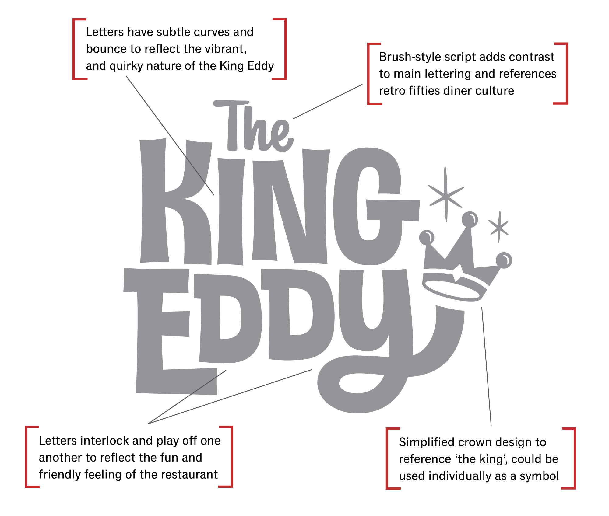
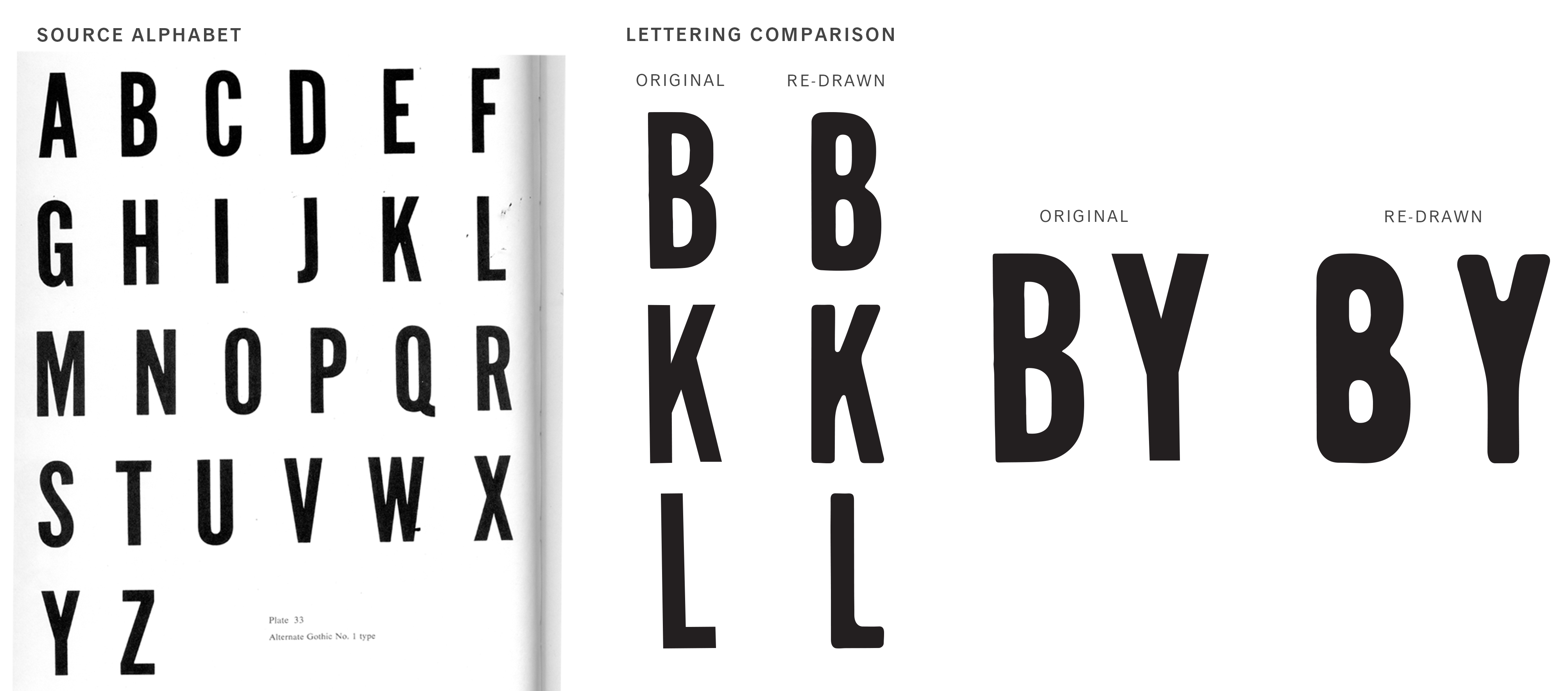
I felt that the lettering should be fairly authentic and like all my favourite signs, should have a little flash while maintaining the functionality. I wanted to incorporate a couple different styles of lettering as many older signs do and reference the materials involved. This sketch shows some more developed lettering, as well as some hanging hardware and textures on the sign.

SignSketch

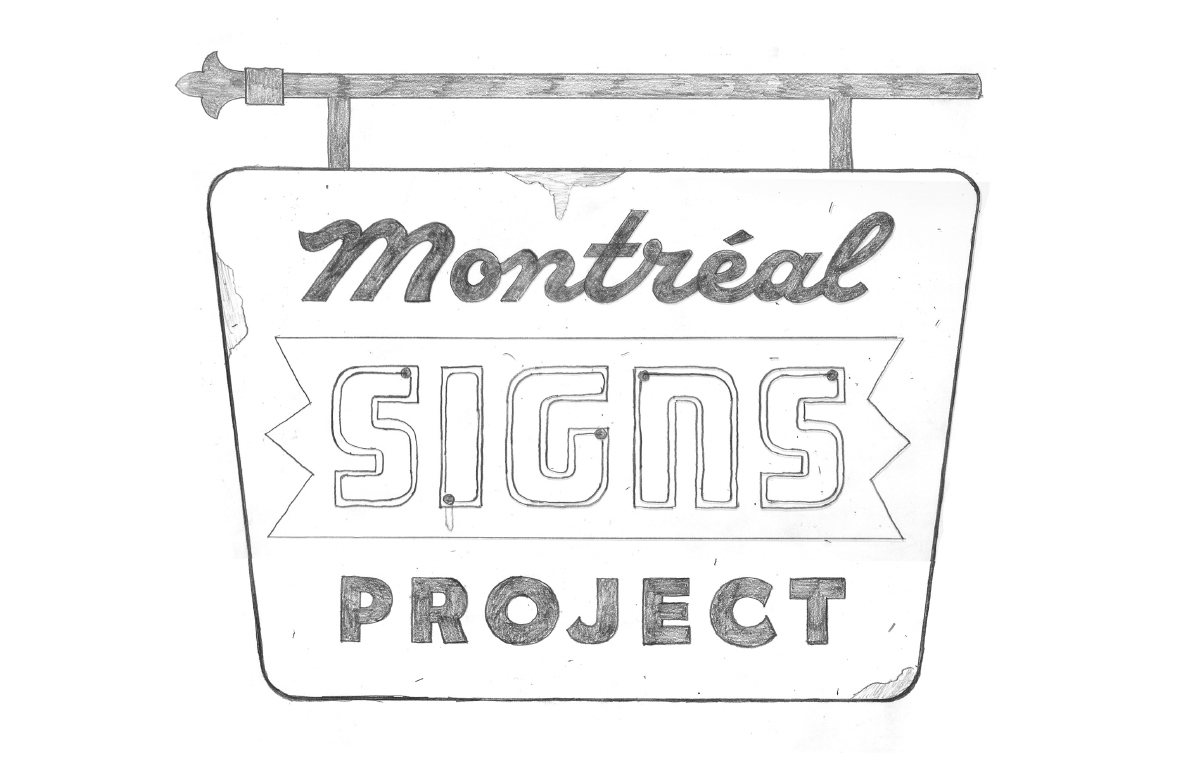
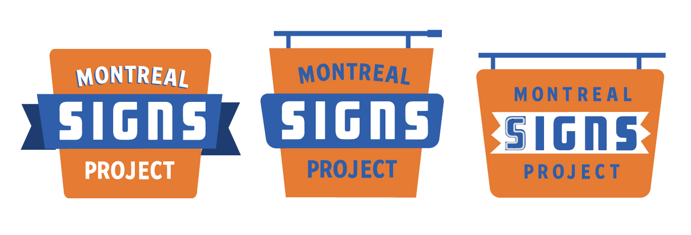
I kept the lettering fairly heavy so that it would read well at smaller sizes. I’m a big fan of bold sign scripts and that was what I was after with this Montréal lettering.

MSPScript

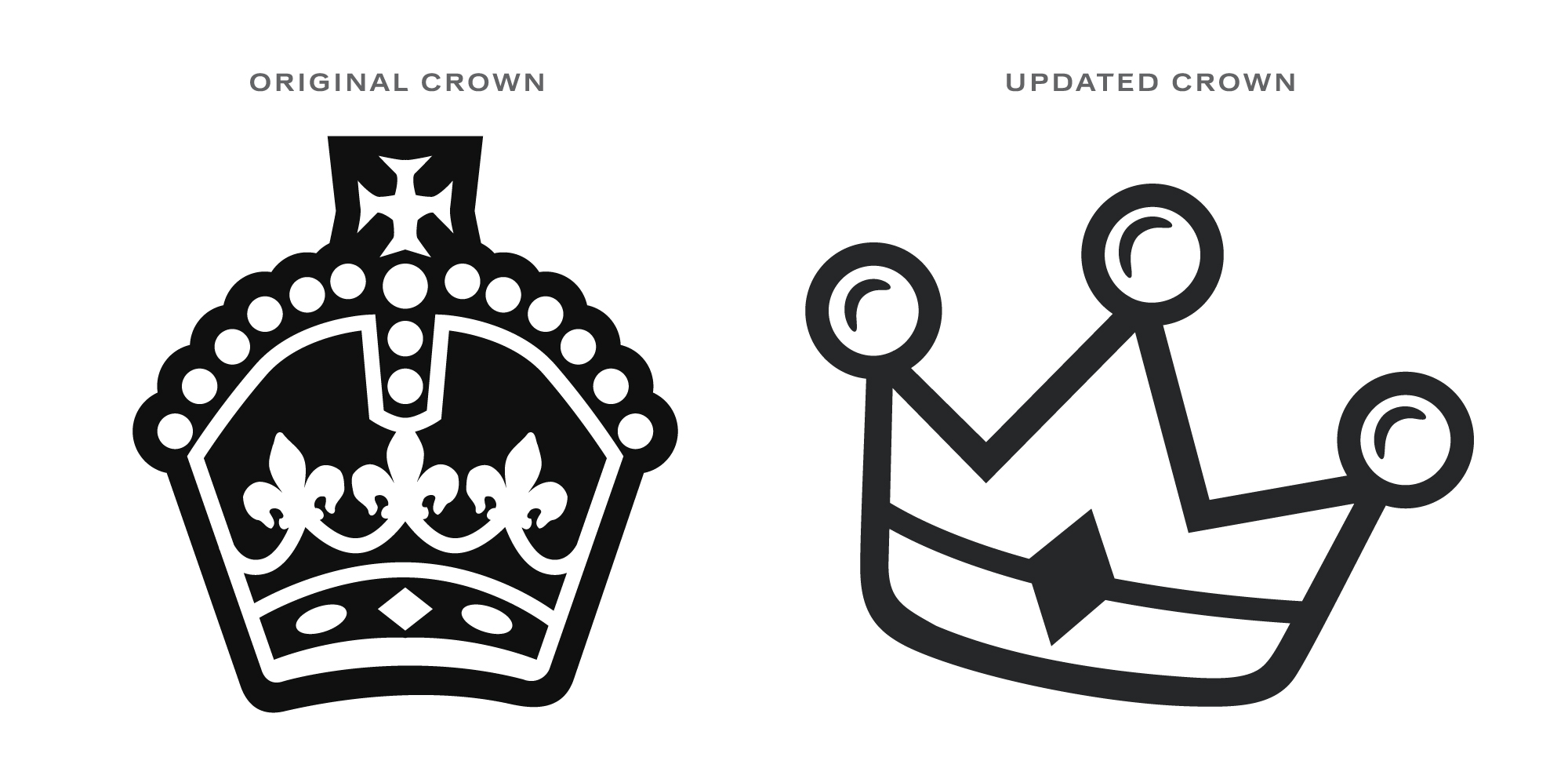
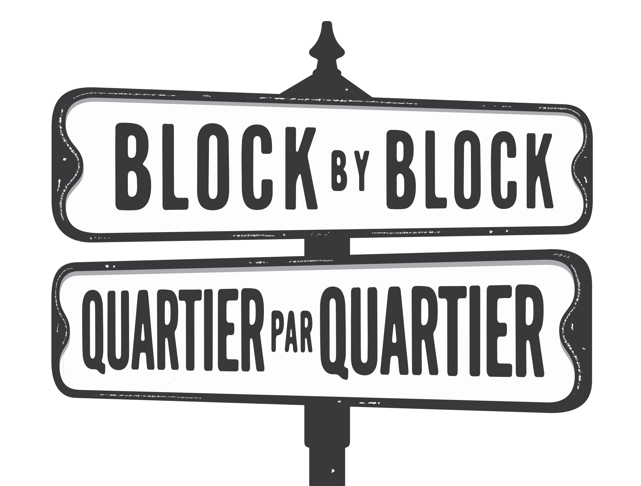
The biggest challenge with this project was creating something that looks like a vintage sign while still functioning properly as a logo. I did explore adding dings and rust textures as well hanging hardware, but ultimately felt like it was veering too much into the territory of illustration rather than branding.

Signs2A

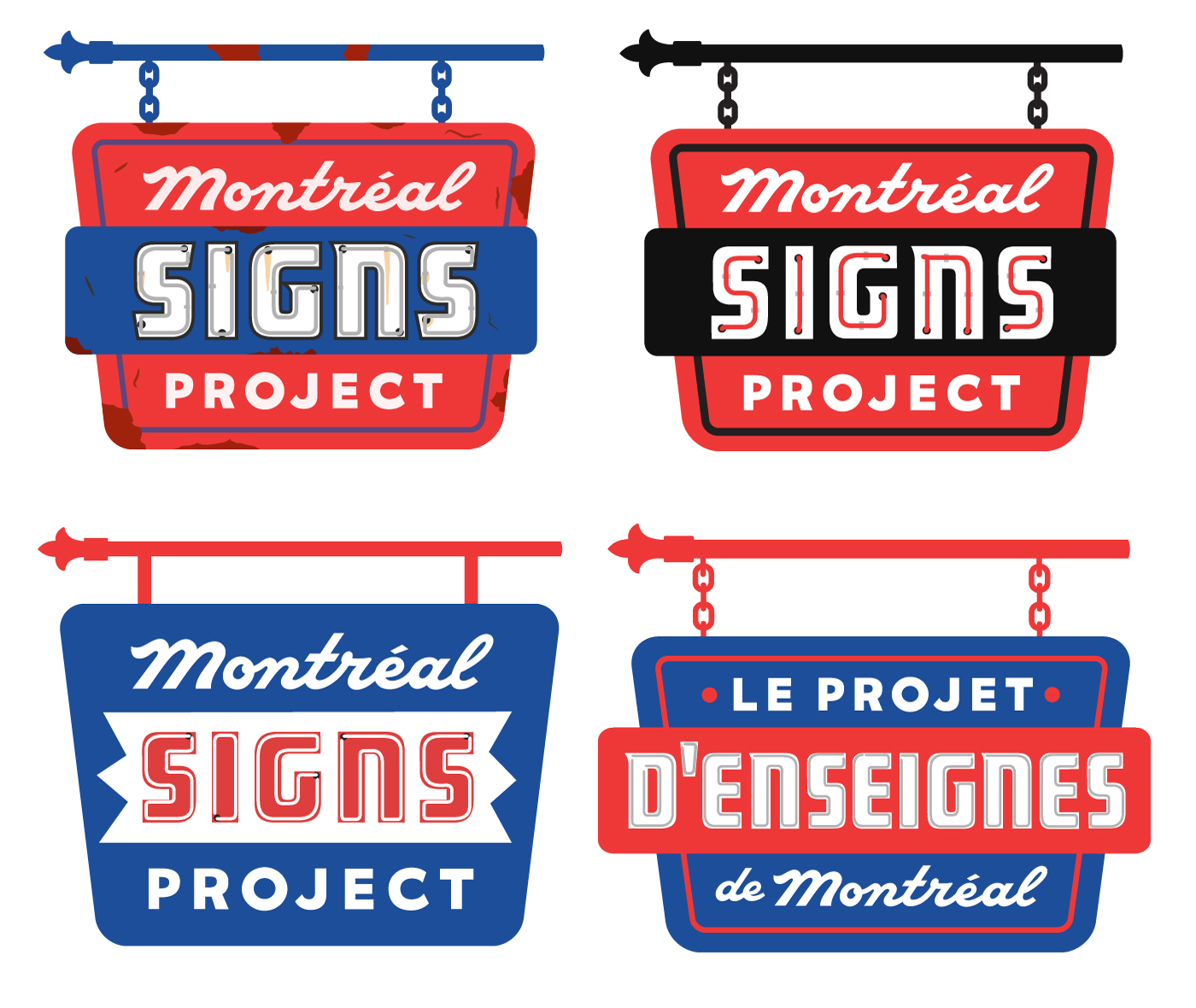
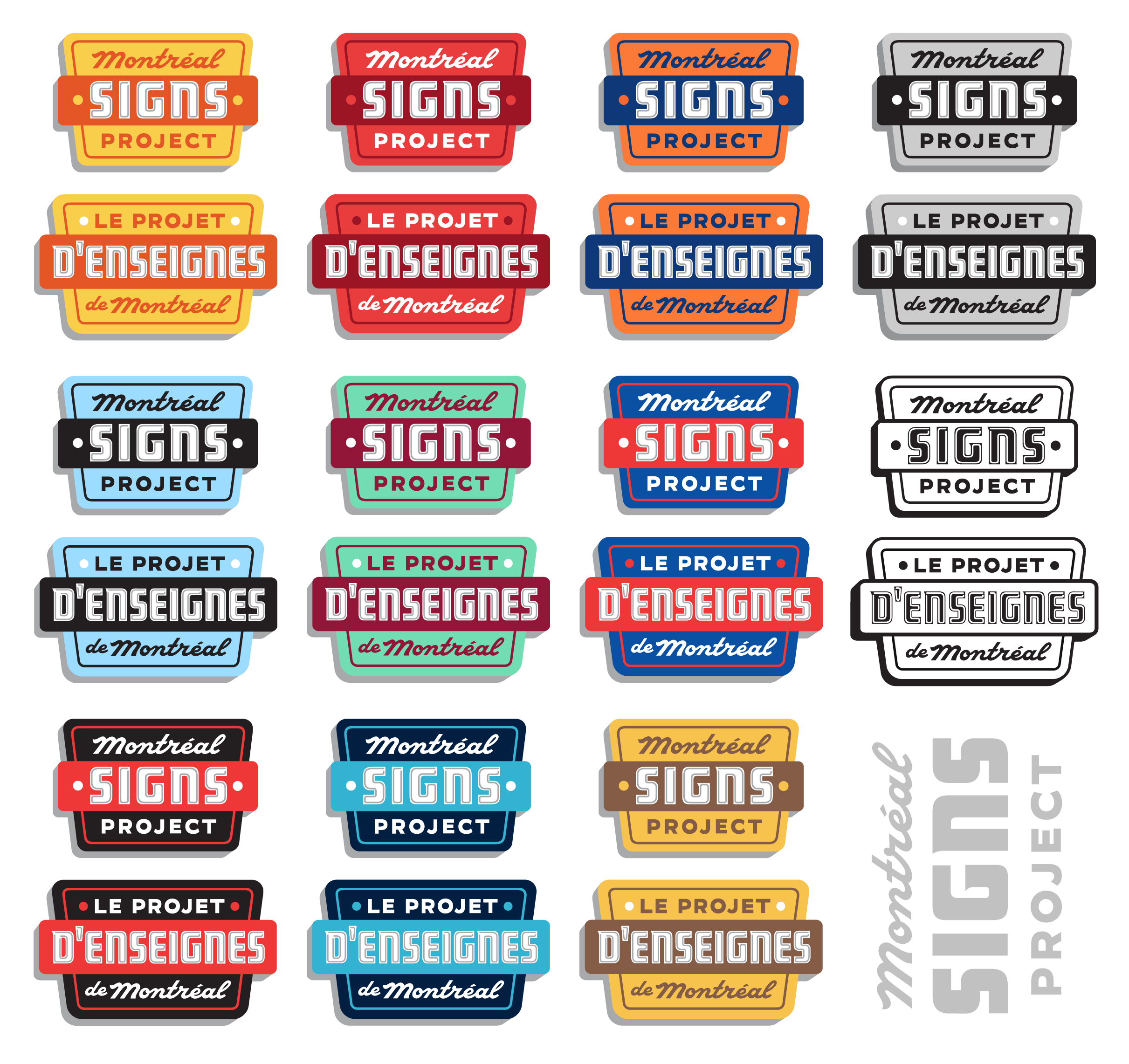
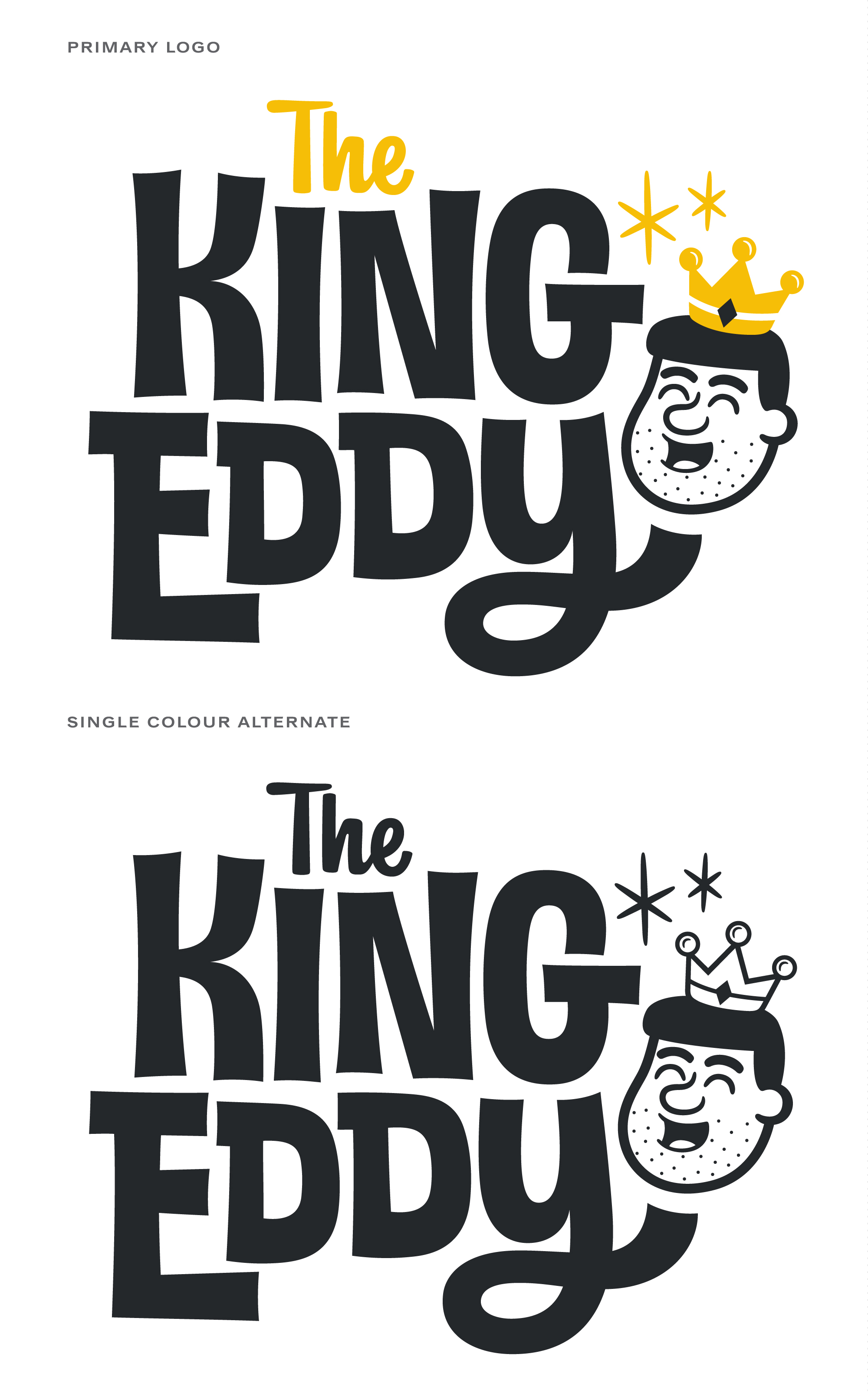
I kept reminding myself that above all it needs to work as a logo, and that guided me through the process. I presented these two final versions, altering the shape of the sign slightly for the French version. You’ll notice that the sign now has dimension to it like an old hanging metal sign, and there is a simplified version of neon tube inside ‘SIGNS’ but without the black electrical pots from the previous versions.

Signs3

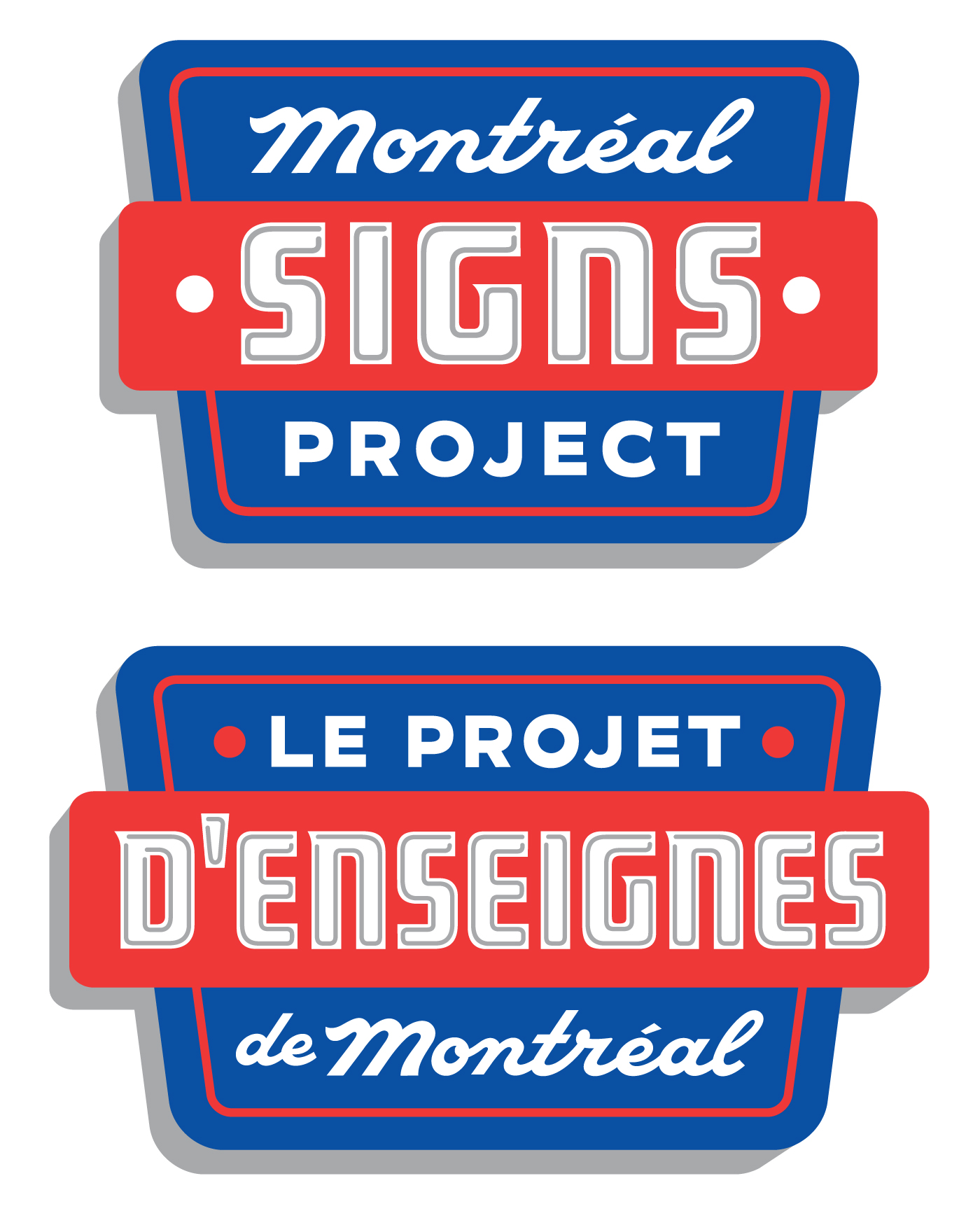
We discussed colours and agreed that rather than having one set colour scheme it would be fun to create a number of versions in classic signage colours. This would allow for some fun options for different applications. A big thanks goes to MSP founder Matt Soar for having me! The MSP has a new Instagram you should follow: @montrealsignsproject and can be found online here.

MSPAllColours

Case Study 4: King Eddy Menu Revamp

At The King Eddy, we are always trying to improve on our past work. Each time we re-visited the menu I tried to make small changes within the format to refresh it but this time I felt like it was due for an overhaul.

The main issue was the amount of information within the space. For simplicity’s sake we originally had the drink and food menu in one place but as the menu grew, it became difficult to accommodate more changes and additions. It had taken on a ‘wall of text’ look that I really wanted to get away from.

Original Menu
KEMenuNov2017v4
KEMenuNov2017v41

My plan was to break up the menu into two pieces. This would do a couple things: create more breathing room for the text making it more inviting to read, and open up opportunities for fun illustrations which are a big part of their aesthetic.

Once the approach was agreed upon, I got started with these full cover illustrations that would bring in more colour and give you a quick first impression of the vibe at King Eddy. Each would have a distinct colour scheme that would run throughout the menu.

illustrations2
illustrations1

I gave the design a refresher by introducing two new typefaces. I brought in a bubbly sans serif for section titles and a more straightforward sans for item titles which helped distinguished sections and items better. This combined with the more generous line spacing was resulting in a look that was much more inviting to read.

Type
Type2

The final detail I wanted to bring in were some spot illustrations to help break up the text and bring attention to key menu items.

Spotillustrations

Here are some photos of the final product provided by the talented Jordan Wiens.
6
2
4
8
5
10
12
14
15

Case Study 3: King Eddy Rebranding

I was recently asked to redesign the logo for The King Eddy restaurant in Ottawa. They were requesting something that featured new lettering created specially for them so I was happy to take a look.

OGLogo

To get my mind warmed up for wordmark designs, I will often look at a variety of lettering styles and take note of what elements could be appropriate for the task at hand. I usually have a fuzzy idea of what the lettering should look like, and going through lots of other work can help bring that idea into focus by reminding me of possibilities to explore and things to avoid. This time around however, nothing I was looking at felt right for the project.

LetteringSamples

The King Eddy has always given me free rein to be as wacky as I like with the graphics and characters, and as a result the artwork is a pretty unfiltered version of everything I like in cartoons. Because of this, I realized it was important to do what comes naturally to me and not try to achieve another voice in the look of the logo.
Characters2

I put pencil to paper, and the first thing that came out was this very rough sketch that would become the foundation for the real thing. I surprised myself at how quickly that happened but I figured it was better not to question a good thing. At any rate, there was still a lot of work to be done to get it to a polished, presentable state.

KESketch

My aim was to make something that felt more warm and friendly than the previous logo. I felt that the lettering needed to better reflect the unique personality of the restaurant, as well as the aesthetic we’ve developed. I included this visual rationale to give a breakdown of why I was doing what I was doing.

LogoRationale

The folks at King Eddy were very happy about the new direction but thought that the new crown might be too much of a departure from their old look. I felt that simplifying the old crown was important as it’s a little too ornate for the current style of the graphics and may not work as well at smaller sizes.

crowncomparison

I proposed the idea to introduce the crown on the head of the familiar king character rather than isolated and that proved to be a good compromise. I provided one-line and single colour alternate versions of the logo and we were all wrapped up!

FinalLogos1A
FinalLogos2
ShirtMockup

Racing To A Red Light

For the better part of the last two years I had slowed down a bit on my client work to explore some ideas on lettering. This culminated in a series of paintings that I showed at Unlovable Gallery in Toronto last month. The show was a great success and you can see the whole series of work, as well as some photos from the exhibition here.

take3 copy

Case Study #2: Not Just Numbers

Not Just Numbers™ is an interactive, mystery game series being held across Canada in time for Canada 150 and Ontario 150. Join a diverse group of community members and scholars to uncover the identities and life stories behind the Canadian census. Sift through historical photographs, newspapers, maps and other clues to solve the mysteries behind each entry.”

Not Just Numbers is a new series for the Toronto Ward Museum that examines the representation of immigrants and minorities in the Canadian census. The census is cold and sterile by design, but its data also represents the intricate stories and lives of Canadians. The clash of those two ideals is central to Not Just Numbers and I wanted to make the graphics a visual reminder of the human element involved in the census.

I toyed around with some sketches for cartoony illustrations, but those quickly got canned because they were too goofy and didn’t have enough of the mechanical element to them.  I also considered spoofing the actual census form but I thought that was playing a little too close to the source material. These sketches are about as rough as it gets but from here I can quickly get an idea of where the concept will work or fall short.

NJNStuff1NJNStuff2

I liked the recurring idea of the sea of numbers from the initial sketches and decided to work with that. After trying out some styles of lettering, I realized that the standardized look of type would be a better fit for the data aspect of the graphic. I created this number grid that at first appears random but is actually made up of all the featured years of the census that are covered in Not Just Numbers.

I still needed a dynamic human element so I created a rip in the numbers as though someone had just torn through the data, revealing the title of the project.

Lastly, to really nerd out on the concept of individuality I took advantage of the alternate characters provided with the Classic Grotesque typeface and made the lower case e’s switch back and forth between styles.
IMG_6444

Design Q&A

I recently received a request for this interview from an aspiring young designer (thanks Dan!) It was a nice chance to think about the ins and outs of the business.

1. Can you tell me about your background and how you got into this field?
In high school I was very much into cartoons and comics but I didn’t have any formal training, so graffiti became a crash course in drawing, colours, painting etc. That led to a lot of mural jobs which pushed me in the direction of art school (there weren’t any backup plans though honestly.) I got my degree at the Nova Scotia College of Art and Design and throughout school I took on many small jobs for friends, and friends of friends. This continued after university and eventually grew to the point where I could support myself with art without a day job on the side.

2. Tell me about your job. Is what you do different in any way from what others in your occupation do?
From what I can see, my approach is a bit more specialized and sometimes more laborious than other people in my field. Much of my work involves creating custom lettering to suit the client’s needs, so I often make it from scratch rather than using a font. Because of my mural painting background I also have the ability to physically execute artwork on a small or large scale for signage, murals etc. This is a bit of a lost art nowadays, where many people can either design digitally, or paint and draw, but most cannot do both.

3. What training and education is required to work in this field and where did you receive your training?
I got a good foundation of education at the Nova Scotia College of Art and Design, but most of my learning has been done after school, on the job. I had a desire to learn about different styles of lettering, illustration, and sign painting and a lot of that I learned just by exploring myself. It’s a good idea to start a little collection of books for reference on topics and styles that interest you. If you can, find a good mentor in your field. When I was in school I met a great teacher who had decades of experience in basically everything I wanted to know. He was kind enough to start looking out for me, and we continue a great informal mentorship to this day. I can’t stress enough how helpful it is to have someone more knowledgeable than you to demonstrate what kind of standards you should be holding yourself up to!

4. What personal characteristics are required for someone to be successful in this occupation?
You have to be proactive. You have to get good at managing your time and delivering things when you say you will. It will be a big help if you can always maintain relationships with clients, even if a project is rocky. Communication is definitely king. I think some of my success is due in part to being relentlessly critical of myself and my work. If you can view what you’re doing through an honest lens and find your flaws, you can then begin to correct them. Of course this is a never-ending game and as your vision improves, more inconsistencies will appear in your past work. It’s actually kind of cruel now that I think about it! :)

5. What are the biggest challenges in this occupation.
The biggest challenges often come on the business end of things. Unfortunately most art schools do not prepare you to be successfully self-employed and deal with all the challenges that come along with it. Knowing how to price your work, how to protect yourself in business, and how to set boundaries for what clients should and should not expect from you is tricky stuff and I had to develop much of it through trial and error.

6. What are the most satisfying aspects of this occupation.
I love the variety of work I get to do. I get bored very quickly, so to be able to do typesetting and layout one week, and then wacky cartoons the next, and then paint a sign the week after that, for me is the best. It has allowed me to explore almost everything I’m interested in stylistically, and get paid for it.

7. Are there many opportunities in your field? What should people do to get started?
There is a lot of work out there, but it can be mystifying to know how to begin. Start by doing work for your friends, do the best job you can every time, and people will start to notice. I suppose it also doesn’t hurt to have a social media presence.

8. What is the salary range for this occupation?
The sky is the limit, but I think it varies wildly.

9. What do you think the future holds for people in your occupation?
I am hoping that people become more educated on the importance of good design. With the surge in popularity of computers and access to design software, graphic design has never been so popular. Despite this, you need more than a Macbook and Photoshop to be a good designer, and hiring someone who is skilled in their trade makes a big difference.

10. What other jobs could you do with the skills you have gained in the field?
I think I could be a good analyst, I end up picking things apart a lot to see why they work or don’t work. That or a mind reader…often times you have to figure out what a person wants but can’t verbalize. You also deal with so many different personalities in this field; maybe I would be a good therapist!

11. What advice would you give a person entering this field?
Do the best job you can, every time, whether it’s a small gig or a huge gig. When you work with clients, you have to accept that some decisions are out of your hands. If you did your best the whole way through, you can feel good about that no matter what happens. Also, be patient. In our society we have a culture that promises instant gratification and recognition and that isn’t really realistic. Getting good at anything in life is definitely a marathon, not a sprint.

12. Who would you recommend I speak in order to gather additional information?
Don’t be afraid to reach out to anyone whose work you admire. Chances are if they’ve been in the business for some time, they’ll have some great insights to share. I have learned a lot through doing the same thing.

Case Study #1: Block By Block

As part of a new series of case studies, I’d like to share my process behind a recent project with The Toronto Ward Museum called ‘Block By Block’. This post will focus on the identity design for the project.

“Block by Block is a participatory, multimedia project. Led by youth, Block by Block seeks to engage the public in a dialogue around the impact local communities have in the lives of newcomers. Through this exchange of personal stories, reflections, testimonies and resources we hope to create a better understanding of the role neighbourhoods play in fostering a more inclusive society.”

I started off by gathering some materials for inspiration to get my head in the right space. Block By Block places great importance on the concept of ‘home’ geographically as well as emotionally so I thought it would be good to start checking out some vintage city maps.

I have always loved old maps. The colours and textures, the typography, slightly wonky print jobs where the colours overlap each other to make unintentional new shades – all of this is stuff that gets me excited.

MapsAlong with my maps, I was referencing old street signs. I had a hunch that the iconic lettering style you see on them could be useful to this project in some way.

StreetSigns

Just as I was starting on some concepts, I got the familiar wake up call from the boss: “It has to be bi-lingual!” For Canadian designers, this is a reality and comes with its own set of challenges. Namely, it’s difficult to create elegant design solutions when one language is much longer than the other and you’re repeating them twice in one space. This was the case here as Block By Block was translated to ‘Quartier Par Quartier.’

My references show up to varying degrees in my finished work. In this case I was playing very closely to the source material. I sent two rough ideas:

1. An illustrative approach where the lettering and its negative space would look streets on a city map
2. A street sign featuring a different language on either side

LogoConcepts2
The second was chosen and I was quite pleased that I had an idea where the repetition of languages worked naturally with the graphic. I was trying to avoid simply repeating one graphic twice, and that was ultimately where the first concept fell short.

I started with the lettering, which would be the bulk of the work. I could have used a condensed sans serif font and been close to the street sign lettering, but there are quirks in the characters on those signs that I needed to get closer to. I took an old condensed gothic alphabet and re-drew it, rounding off the edges and closing the counters a bit to imitate the way the ink on the street signs bleeds, creating a warmer look.

Lettering

I noted there was a flaw in my original concept that meant the design would be too wide. I instead opted to stack the signs on top of each other, adding some decorative hardware on top. This did two things:

1. Gave me a more ‘square’ layout that would work better at various sizes
2. Allowed me to ‘turn’ the signs and fit the longer French into the same space
Sign

After trying out some background colours that felt too arbitrary, I went back to the maps. I used similar colours and textures from the old maps and created an abstract cross section of blocks from a city. This would also provide me with a motif I could adapt to other materials throughout the project. In the coming months I’ll be sharing some of the ways that these graphics will be used!

BXBPostcard


Lufa Farms Updates

Some fun new updates in the Lufa Farms section, including lots of illustration and a whole bunch of icons! A small glimpse of the many things we’ve worked on together over the last couple of years.
webads

Website Updates

Hi all, and happy new year! I am currently in the process of updating some sections of the site with new work. The King Eddy section has extensive updates with lots of new treats and you can view that here. Stay tuned for further updates!

lightboxposters

Canadian Internet Registration Authority

I created this comic strip and infographics as promotional educational materials for the Canadian Internet Registration Authority. It was great working on a project that was fairly open stylistically as it allowed me to explore some approaches to illustration I don’t typically take. You can see the rest of the project here.

CIRA Comic